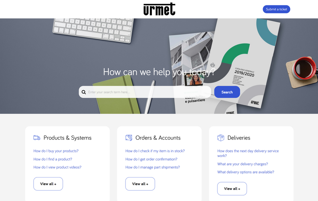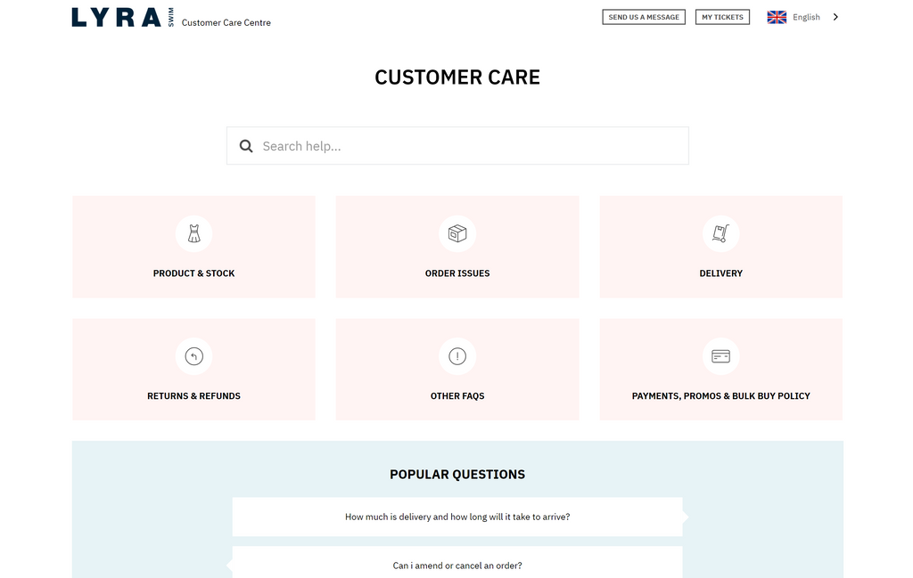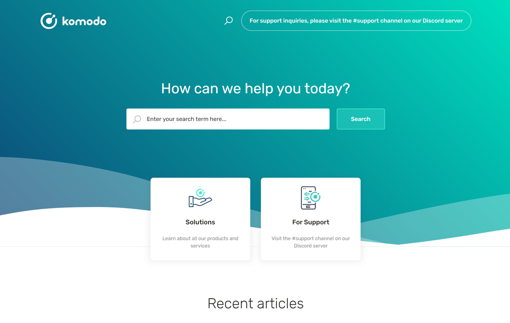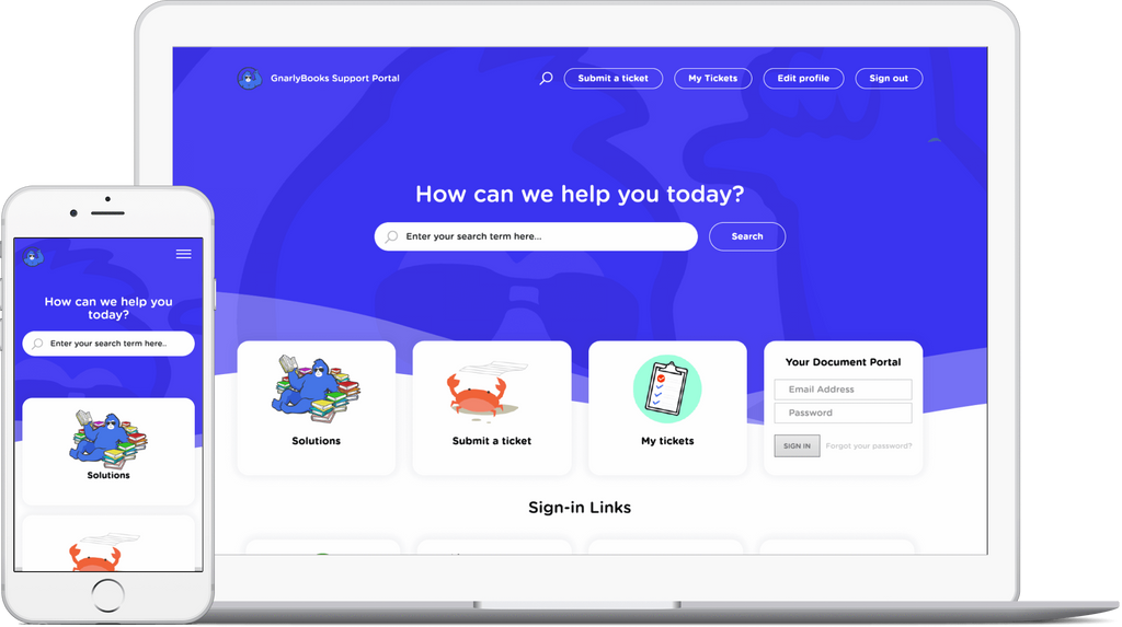
The modern design of your website and Freshdesk customer portal shows your visitors how successful and trustworthy your company is. A professional-looking and intuitive Freshdesk knowledge base encourages your clients to self-serve 24/7 instead of bombarding your agents with repetitive requests. Thus, it significantly lowers support costs.
Breezy Themes has extensive experience in building Freshdesk and Freshservice knowledge bases, and we’d like to share some modern design trends with you.
Minimalist and Simple Design
A good interface is an invisible one: plenty of space, a minimum of accent colors, and content in the center of it all. This trend is especially important for the Freshdesk customer portal, where information is what people look for, and too many bright colors and design elements may distract users.

Airy and Complex Gradients
Gradients became popular some time ago, and they are still relevant. In 2021 they will look light, airy, and more voluminous. This design trend will be mixed with muted, pastel colors, and 3D icons.

Gradients are also becoming more complex compared to linear ones. To achieve this complexity, you should mix various colors and add an overlay. Also, to show volume and depth, web designers use color blur effects as a background on the websites.
Consistent Icons
You should pay attention to the accuracy and integrity in the design of your website and Freshdesk customer portal, and icons aren’t an exception. It is already unacceptable to use various icons from different collections. They should have the same style and line thickness. To achieve this, use new ready-made libraries that look modern and professional.

2D Illustrations
Illustrations are no less popular than icons. 2021 is the year of unique graphics that is unlike anything else. Everything from simple to complex illustrations will work great.

However, be careful, don’t use free 2D illustration packs because they look the same, and your sites can become boring. Now, every second website has the same illustration sets from free collections, which are very few. But this does not mean we should abandon them. Try to find something different from other websites. But of course, it’s much better to get custom 2D graphics from designers. In the future, we’ll see more collections that you can safely add to your website and Freshdesk knowledge base.
Another trend is absurd illustrations. Don’t be afraid of insane images; break the logic and surprise your users in 2021.
3D Icons and Illustrations
3D icons and illustrations are simple shapes and objects that look fresh on both a website and the Freshdesk customer portal. But a great number of similar collections on the internet considerably depreciates them. The problem is that this design trend is only developing and will be fully formed later. So if you’d like to add 3D icons and illustrations now, it’s better to create your own.
To Sum It All Up
2021 is the year of simple design with illustrations and 3D graphics. Websites and Freshdesk customer portals should be minimalist, lightweight, and less visible. Details have become essential.
If you apply these design trends on your Freshdesk knowledge base, your clients will use it more frequently rather than contacting support staff.
If you want to customize your Freshdesk customer portal but don't know what to start with or don't have time, reach out to Breezy Themes, a Freshworks partner for Freshdesk and Freshservice themes and customization.
See more Freshdesk designs